Interpret your data
Given the threat that air pollutants pose to human health, it is extremely valuable to be able to access and interpret air quality data. There are two main types of air quality data that you may be able to access: quantitative data and qualitative data. Both types of data present meaningful information about the levels of exposure to air pollutants.
Interpreting quantitative data from your area
Quantitative data provides information that can be measured and expressed with numbers. Quantitative air quality data refers to the numerical measurements that express levels of air pollutants. To gain high accuracy quantitative data, expensive monitoring equipment is usually required. As a result, the majority of citizens cannot obtain the kind of air quality sensors that allow for accurate quantitative measurements. However, many governments and industrial associations have established monitoring stations that are equipped with the instrumentation needed to obtain reliable numerical data. The data produced from these monitoring stations can often be found on a public database or requested by an engaged citizen.
To seek out the air quality data of your city or country, try searching “[Your area] air quality database.” Note which air pollutants the data is available for. You will now be guided on how to interpret the data you find on the web.
Comparing the numbers displayed in your area to the guidelines established by the World Health Organization will help you to understand the human health risk posed by air pollutant levels you may be exposed to. The WHO air quality guidelines provide upper limits for outdoor levels of selected air pollutants. Each of the air pollutants selected have been identified as harmful to human health, and the values of the upper limits were determined based on current scientific evidence.
The upper safe levels (also called “threshold limits”) express levels of pollutants that should not be exceeded to minimize risks to human health. These limits are given as mean values (average levels) of pollutants over a certain interval of time. As an example, look below at the WHO air quality guidelines for PM10. Two thresholds are given: a 24 hour mean (expressing the average level of PM10 over 24 hours that should not be exceeded) and an annual mean (expressing the level of PM10 over the course of a year that should not be exceeded). The WHO 24 hour mean given is 50 µg/m3. Therefore, if you discovered that the average level of PM10 over 24 hours in your area was greater than 50 µg/m3, this would imply that the WHO air quality guidelines for safe levels were exceeded for PM10. However, if you noticed that the level of PM10 only exceeded 50 µg/m3 for a few minutes, this may not be of concern.
To familiarize yourself with interpreting this kind of air quality data, work the following exercise:
6am – 70 µg/m3
7am – 90 µg/m3
8am – 170 µg/m3
9am – 180 µg/m3
10am – 170 µg/m3
11am – 90 µg/m3
12pm – 70 µg/m3
1pm – 40 µg/m3
Is the WHO 8 hour mean threshold for ozone exceeded? Hint – you may need a calculator.
The calculation is shown below:
(70 + 90 + 170 + 180 + 170 + 90 + 70 + 40) ÷ 8 = 110
Another important piece of interpreting your data involves understanding units of measurement. The units of measurement used in the WHO guidelines are microgram per cubic meter (µg/m3). These units express the mass of an air pollutant per a cubic meter of air. However, other units are commonly used such as ppm (parts per million) or ppb (parts per billion). Parts per million refers to how many particles of an air pollutant are present in a given sample air composed of 1 million particles. It may be helpful to think of X ppm as a fraction X/1,000,000. If the measurements you attained from your area are given in units other than (µg/m3), consider approximating your data in (µg/m3) by typing into your web browser “convert [units] to µg/m3.”
The WHO air quality guidelines
| PM2.5 | PM10 | O3 | NO2 | SO2 | |
|
Annual mean (µg/m3) |
10 | 20 | 40 | ||
|
24 hour mean |
25 | 50 | 20 | ||
|
8 hour mean |
100 | ||||
|
1 hour mean |
200 | ||||
|
10 minute mean |
500 |
How did the measurements from your area compare with the thresholds set by the WHO?
To learn more about the WHO air quality guidelines visit: http://www.who.int/mediacentre/factsheets/fs313/en/
Interpreting your qualitative data
Qualitative data provides information about qualities, rather than quantities. In terms of air quality sensing, qualitative data measures the relative fluctuations in air pollutant levels. Although citizens rarely attain the high-grade sensors needed to provide high accurately quantitative, citizens can easily attain sensors that provide meaningful qualitative data.
We have provided instructions on our website on how to build low-cost, portable air quality sensors that measure qualitative data. One of the benefits of using a small portable sensor, is that measurements can be taken at almost anywhere to gain an assessment of air quality in local environments. In fact, this is an advantage of low-cost portable sensors that high-grade government sensors do not have. If a government does mandate air quality sensing, the monitoring stations are usually stationary and dispersed throughout an area. Although this method of monitoring does provide an overall assessment of the air quality in a particular region, it cannot account for the local fluctuations in air quality between monitoring stations.
As a result of their portability, the sensors presented on our website can give an assessment of the air quality that is tailored to the daily life of each individual. For example, measurements can be taken from inside the home, on route to work, inside the workplace and so on. In order to make the data more meaningful, it is also important to interpret collected data relative to reference measurements. To illustrate this, perhaps you noticed dramatic spike in particulate matter levels when walking past a construction site in which the workers are all wearing air quality masks. This could act as a reference measurement that represents poor air quality. If particulate matter levels at the workplace remained as high as those at the construction site, this would pose concern.
Here is an example of particulate matter measurements taken while walking outdoors, walking near a smoker, and then walking inside once again. A later measurement was also taken in which the sensor was exposed to smoke from a candle burning under a beaker.
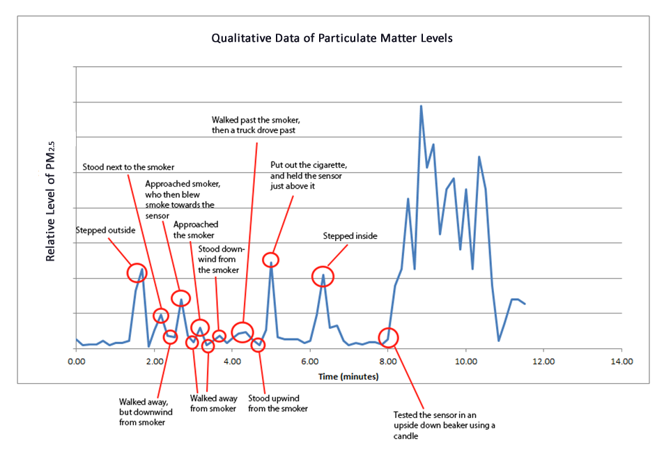
As you may notice, particulate matter levels peaked when walking outside, and stepping inside to a building. This was attributed to blowing dust particles located near the entrance to the building. Peaks were also noticed when the sensor was near smoke from a cigarette (from 2-4 minutes). During this time interval, the largest peak in particulate matter occurred when the cigarette was diffused and held just above the sensor. From 8-11 minutes, the sensor was exposed to the smoke from a candle contained under a beaker. Since smoke was not able to escape, it is understandable that the levels of particulate matter were much higher than being outside near a smoker.